A world of (mis)information
We live in a world of information bombardment. News is ubiquitous. Our Facebook feeds are littered with targeted news reports. Breakfast television programmes blast through airport speakers drowning out moments of silence. Since the days of the educated bourgeois, keeping up with the news has been seen to hold a sense of prestige in society. News consumption has become a daily habit. More than that – our professional registrations necessitate that we are evidence-based. So having access to the latest health and science news has become a part of life. But where is the time?
Multimedia magic
We want news, and we want it fast. No longer do we have time to stew over information, fact check, source check, data check. We rarely have time to read. Please summarise your findings, put it on a graph, splash on some colour (some animation if you will) and hey presto! Maximal information consumed in minimal time. We have been taught to be cautious of opinions, and instead look for facts. So what could be better than multimedia! Infographics, short videos, colourful graphs – all displaying data, displaying facts. You can’t argue with data, right? But even when the methodology is sound, the sample size robust, and the analysis stacks up, we can still be fooled by the way data are presented.
Manipulation and motivation
Historically, graphs and data were the play thing of nerds in their science journals. But no longer. Those cunning folk in the marketing and advertising world have cleverly seen the potential of statistics; namely graph manipulation. Making subtle choices in graph presentation reaps clear benefits. Sales. Profits. Votes. We see this in political arenas, with claims of fake news. Even those in research, vying to get their data published, use sexy graphs to one-up the competition. While motivations are clear, the manipulation is not so obvious.
Beating them at their game
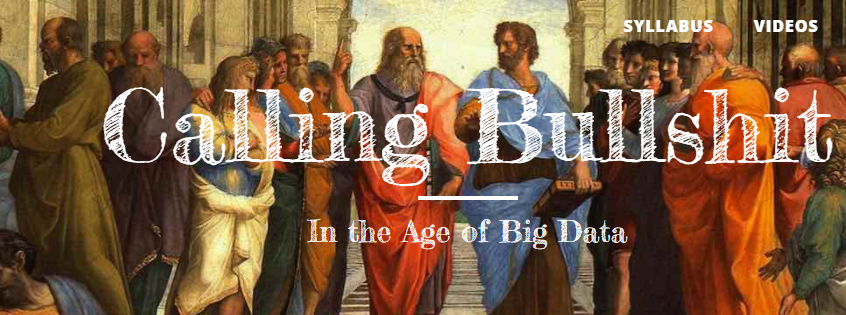
To avoid buying snake oil, we need to see past the con. Past the tricks of misleading graphs. So here are some handy tips to guard yourself against graph manipulation. If you have tons of time, two college professors at the University of Washington have created a course called ‘Calling Bullshit’ and offered syllabus and lecture videos free online. If you have a bit of time, read on, but if you’re very short on time, true to the world of multimedia, feel free to watch the video at the end of the blog instead.
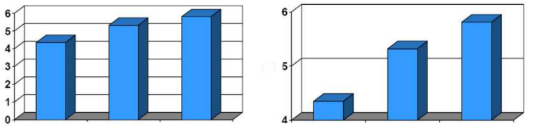
Bar graphs – does the scale start at zero? Zooming in, or truncating, a certain range on the dependent axis can make insignificant differences look hugely important. This is specifically true for bar (or column) graphs used to show the absolute magnitude of data. See how the graph on the right makes it appear three times larger, when really the difference is small. Bar graph scales should start at zero.
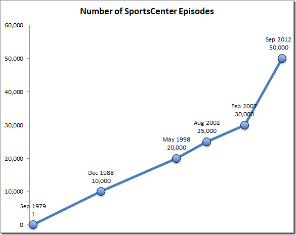
Line graphs – check the scale spacing! Unlike a bar graph, line graphs are used to display change over time. A lack of consistency in scaling can distort the data. Check the time scale is spaced evenly, and there are no big jumps, like this cheeky graph below.
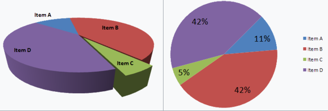
Beware the 3D effect. Changing perspective can distort how data looks. The slices closer to you will appear larger than those further away.
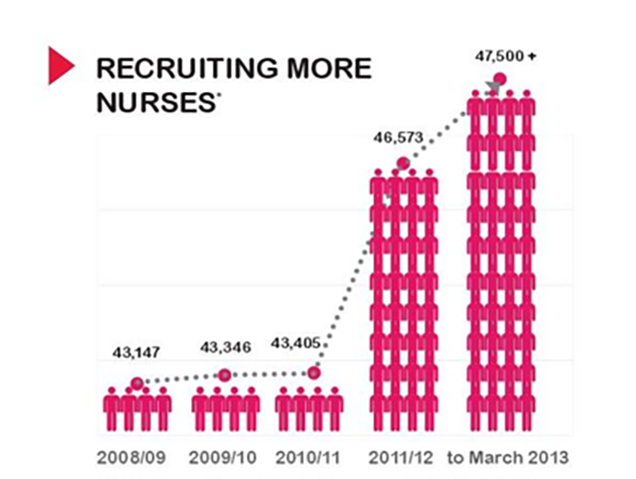
Inflated pictograms. The use of an icon to display data is a design flair, but can be used improperly to dramatise and mislead. These stick figures don’t match the numbers of nurses they claims to represent, providing a visual display of a 1000% increase, when the actual increase is about <10%.
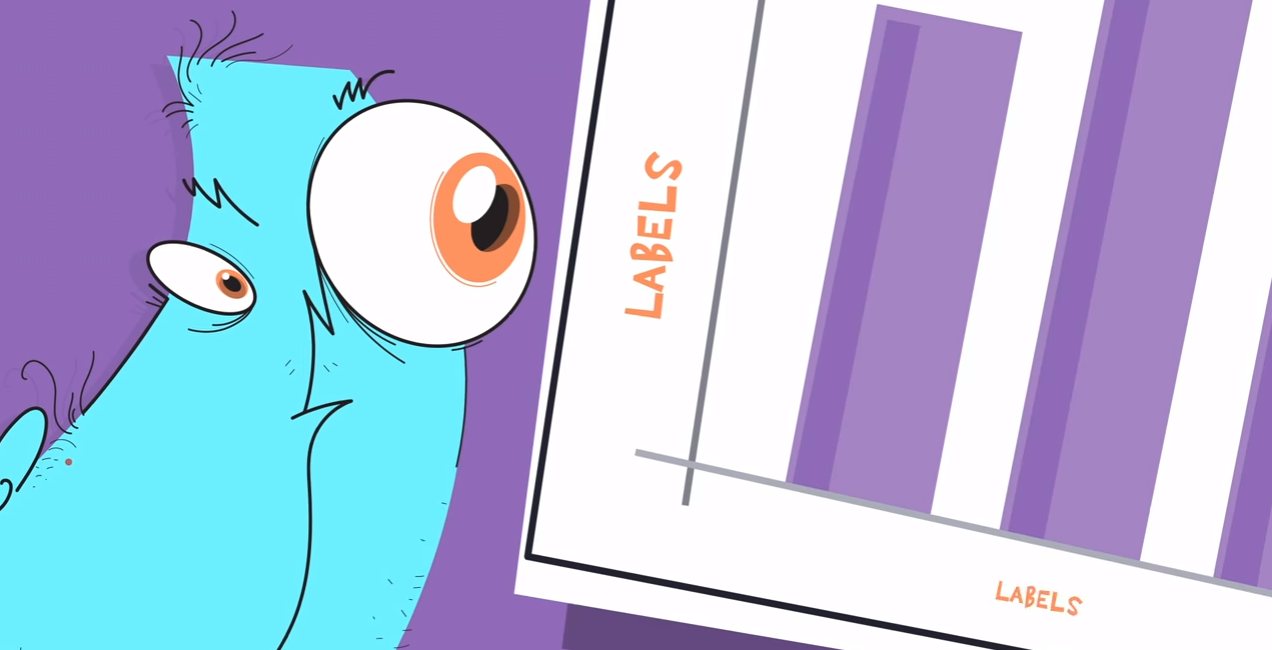
In addition, make sure you understand the context of the graph. Has an important contextual element been omitted that could account for this shown change? And that labelling is clear and detailed.
Perhaps Edgar Allan Poe had it right,
“Believe nothing you hear, and only one half that you see.”
– Hayley Leake
comments